Wednesday, May 30, 2012

Chapter 13: Color

(1)            Colors Movie Poster.  1988. Web.
                 http://www.imdb.com/title/tt0094894/


Not just a bad ass Sean Penn film from the 80's (1), Color infiltrates are very psyche.  It reminds us of moments and objects of affection.  It can unleash overwhelming emotions.  We dress ourselves up in colors, so we can peacock around.  No doubt about it, color is intertwined with the human experience.  But how do we use it in our design?  More importantly what is color?

Color is what is present in our visible spectrum.  We see by the Hue (2), that there are distinction in that spectrum.  The color wheel shows us the organized spectrum based on the sequence the appear.

What about the use of color?  Different Color Systems allow for different uses.  Additive Color System is the combination of different wavelengths of light to create the visual sensation of color.  This is commonly used in Film, photo, and print.  Subtractive Color System is where pigments, physical substances, are combined to the visual sensations.  Here some of the wavelengths of light are absorbed by the substance, thus being subtracted, leaving only the reflected wavelengths to constitiute the color.  This is used in paintings, clothing, and textiles.


(2)                                                             Hue.  May. 29, 2012.  Web.  http://www.layoutsparks.com/pictures/colourful-6

(3)              King, Mike.  "Arcade Fire Poster".
                     Silkscreen.  17"x26".  May 28, 2005.
                     Web.  http://www.newburycomics.com
                     /rel/v2_viewupc.php?storenr=103
                 &upc=103-802564NEWBU

(4)                 Bon Iver Concert Poster. 2008.
                   Web.  http://www.spraygraphic.com
                   /ViewProject/1972/normal.html 
What about changing the Value or Intensity of a Color?  This is simply done by adding black or white to the original color.  Doing this you can create warm (3) or cool colors (4).  Warm colors are those on the color wheel closer to the yellows and reds.  Cool color is created as you move close to the blue side of the color wheel.


How about we assert some Color Dominance and provide emphasis using color!  (5)


(5)                                                                     Loose Collective & Rhodes, Nick.  "Crystal Antlers Poster".  2008.  Web.
                                                                         http://loosecollective.net/10946/169301/-selected-work/crystal-antlers


Lets revisit our old friend atmospheric perspective and make it Atmospheric Perspective With Color.  This is again where the hues dull as the objects fade into the atmosphere.  These colors become increasingly more neutral, until we see them as a blue-gray.  (6)


(6)                                                                                   H South.  "Aerial Perspective".  2012.  Web.
                                                                                  http://0.tqn.com/d/drawsketch/1/0/J/P/3landscapecontrast.jpg
(8)         Burger King Logo.  2012.
          Web.  www.bk.com
(7)  Taolmor.  "Eyes in Complementary Colors".
2000-2012.  Stock Image.  Web.
http://www.dreamstime.com/stock-photos-stock-photos
-eyes-complementary-colors-image6268213


As we are getting all dressed up we don't want to look like hobo's, so we pick out clothing that all looks good together.  This is the concept of Complimentary Colors.  (7)  The science behind it is picking colors on the opposite side of the color wheel that accentuate each other.  They also neutralize each other in the mix.  Another scheme to use multiple colors are the Triadic Colors.  (8)  This is three colors equally spaced out on the color wheel.

Heading into a career in interior design, color may be the most important element of them all.  Not only learning the color wheel, to master what colors work with other colors, so I can please my clients, but knowing the relationships of all the colors will help me break down norms and use color to define the wild side of my design.

Colors, ca ca ca ca colors.


Tuesday, May 29, 2012

Chapter 12: Value

Now we aren't talkin McDonald's dollar menu.  Value is as simple as light and dark.  Okay maybe that does sound like McNuggets.  Gross.

Today, we want to explore the Value Contrast or the relationship between the light and the dark.


(1)                                                      Chueh, Luke.  "Black In White and Red All Over".  Acrylic + Ink.
                                   8"x10".  2005.  Web.  http://www.lukechueh.com/paintings/black-white-red.html


One way to explore this is to look at Value Pattern (1).  This is, independent of color, the arrangement and amount of light and dark differences.

Next, we look at Value Emphasis.  Here the designer actually uses the light verses dark contrast to create the focal point (2).

(2)                                                       Edward Sharpe and the Magnetic Zeroes.  Photo.  2010.  Web.
                                                         http://www.dialogueinc.com/2011_01_01_archive.html


Still talking about light and dark, we need to introduce Chiaroscuro.  This is how one implies depth and volume to a two-dimensional work of art (3).


(3)                                                                                      Chiaroscuro. "Chiaroscuro".  Album Art.  Feb. 11, 2011.Web.
                                                                                                         http://futurerecordings.bandcamp.com/album/chiaroscuro


Something we have talked about before is Aerial Perspective, but what about the relationship between it and value?  With aerial perspective we see the foreground soak up the contrast and everything in the background gets washed out.  This creates a feeling of distance.  In the distance the the lesser contrast gets absorbed into the atmosphere (4).

(4)                                 Sandy.  "Night Photography".  Photo.  Nov. 16, 2009.
                                         Web.  http://www.thewebdarkroom.com/?paged=2


Last we need to recognize Shading.  This is the actual use of value.  The proper use of shade can take a piece of work from being nothing more than a drawing to being completely photo realistic (5).  Shading can also be used to create nonobjective work to provide added interest.

(5)            Baca, Billy.  "Willie Nelson".  Tattoo.
March 30, 2011.  Web.
               http://www.facebook.com/photo.php?fbid
=10150158090857337&set=a.10
150106284547337.272181.
721127336&type=3&theater

Now, go get a McFlurry, we're done.


Chapter 11: Illusion of Motion

(1)                                                           Bijijoo.  "Still Life with Oprah, Eggplant, Squash, and a Balloon".  Oil on Panal.
                                                          13x15.  May 22, 2011.  Web. http://bijijoo.com/2011/still-life
                                                        -with-oprah-winfrey-eggplant-squash-and-a-balloon


We all know that it is not possible to capture true motion in a still.  However, artists and designers have been driven to capture the essence of motion since the dawn of art.  This is now seen as an illusion.  But as we all know illusions can be very real.  (insert evil laugh here)


Two areas that help create the illusion are Stillness and Arrested Motion.  Although they sound similar they are different in the way of stillness being much more natural.  An example would be a still life.  (1) Whereas, arrested motion is more human.  The human form cannot stand still for prolonged periods of time, so we have to adjust and this signifies the pause in motion.  (2)

(2)                                     KC.  "Monster Creeps; Layer 1".  Paint on Glass.
                                     August 1, 2011.  Web.  http://kaseytararuj.blogspot.com
                      /2011/08/1950s-ax-murderer.html


Four other ways to suggest motion in a visual design are:  Anticipated Movement (3),  Repeated Figure (4),  Blurred Outlines (5),  Multiple Image (6).


(4)           Muybridge, Eadweard.  "Horse Jumping".  Photo.
Hove Museum.  March 9, 2010.  Web.
http://ejmuybridge.wordpress.com/2010/02/


(3)        Wolfe, Megan.  "Birds in
Motion".  Oil on Wood Panal w/
palette and steak knives.  Feb.
13, 2012.  Web.  http://patronofthearts.com
/2012/02/reformation-movement-color/


(5)                                                                   "Pete Townhend, throwing his guitar in the air".  Photo.  Jan. 31, 1968.  Web.
                                                                 http://mp.natlib.govt.nz/detail/?id=59432&l=en

(6)                                                 Jim Abbott 1993 Upper Deck Fifth Anniversary Insert Card.  Web.
                                                 http://autographsforsale.com/jim-abbott-1993-upper-deck-5th-anniversary-insert-card.html


Other ways to create motion are more scientific.  These actually trick the restless eye into believing something is moving.  These involve Tapered and Undulating Lines (7), Flickering Effect of Afterimage, and the use of Intense Color.


(7)                  Pave'.  "Rug".  Silk Pile w/ cotton-
                  chenille weft.  Oct. 2008.  Web.
http://designawards.wordpress.com/2008/10/


(8)                Meyer, Glenn E.  "Effects on Flicker-induced
                  depth on chromatic subjective contours".  Aug. 1987
 Web.  http://psycnet.apa.org/index.cfm?fa=buy.option
ToBuy&id=1987-33410-001

Sunday, May 20, 2012

Extra Credit Art Show 2!

The West Austin Studio Tour taking place  May 19-20, had over 160 artists open up their studio's to the city of Austin.

I was cordially invited to visit the studio of Honoria Starbuck, local artist and professor at the Art Institute of Austin, to see her recent artworks.  Honoria works out of her newly built, modern, 2600 square foot home in the lovely Brentwood neighborhood.

(1)                                                Starbuck, Honoria.  Tai Chi Sword Painting.
                                     Photo by B. Tuber.  2012


Honoria showcased several different styles of work across multiple medias.  The artwork ranged from Tai Chi inspired Sword Paintings, (1)  paintings in the ancient asian style wet on wet, (2) and art created on the IPad.

(2)                                                                               Starbuck, Honoria.  Wet on Wet.
                                                                                Photo by B. Tuber.  2012


When asked about the Tai Chi inspired art, Honoria responded "my friend and I were doing Tai Chi and decided to put brushes on the end of our swords to create the paintings".  (3)

(3)                                                                            Tuber, Brandon.   "the Sword"  Photo.  2012.


Chapter 10: Illusion of Space

It all starts on the Picture Plane.  The two dimensional surface on which you create.  (1)  The area you choose to place your image.  Paper, wall or bus, the plane is up to you.

(1)                                              Leo, Dan.  "Quick Van Paint".  Spray Paint on Van.
                                                May 19, 2012.  Web. <http://danleodesign.com/2012/05/van/>


An element that can be used to create length on the picture plane is Foreshortening.  This makes subjects appear to shorten as it moves closer to the viewer.  (2)  This helps create a sense of realism in the picture plane.  

(2)               Caroselli, Angelo.   "Saint Jerome in the
                      Wilderness".  Oil on Panal.  1620-1630.
                 The Walters Art Museum.  Web.
                   <http://art.thewalters.org/detail/888/
                    saint-jerome-in-the-wilderness/>  


Another way to achieve space is to show the relationship of subject by size.  (3)  By photographing the moon in front of the earth we see that is much smaller in comparrison, however looking up at the moon from the earths surface we might assume it is larger than it is.

(3)                                                                           Celestia.  "Moon and Earth".  Photo.  Web.                                                                                           <http://fisica.cab.cnea.gov.ar/estadistica/abramson/celestia/gallery/slides/Moon-Earth-2.html>

(4)            Hundley, Sterling.  "Vertical Hold"
Paint on Canvas.  2010.  Web.
<http://sterlinghundley.com/> 
Other ways of creating the illusion of space are                       Vertical Location, Aerial Perspective, Multi point perspective, and Amplified Perspective.  A way of expressing distance by placing objects higher on the picture plane is vertical location.  (4)  Aerial perspective, also known as Atmospheric is the use of light and dark to show depth.  (5)  When different objects have different vanishing point, that are not parallel to each other, are introduced in to a piece we see multipoint perspective.  (6)  Amplified perspective is seen when you point something directly at the viewer.  (7)


(5)              Orange House Photo.  "Arial2".  Digital.
360 x 316.  2006.  Web.
<http://www.orangehousephotos.com/
my_weblog/2006/12/color_theory_an_1.html>


(7)                                          LSD s.l.r.  "Love & Hate"  Photo.  Web.
                                                          <http://www.neatorama.com/2006/12/28/
                                                         love-and-hate-baby-knuckle-tattoo/>


(6)                                  Escher, MC.
               "Relativity"  Lithograph.
1953.  Web.
<http://www.mcescher.com/>


Finally, we will see Isometric Projection.  (8)  This is creating space  without using 1,2, or 3, point perspective.  An abstraction, showing 3D images without any sense of depth.   This can create ambiguity because all of the objects appear to be the same size.  To make it even more confusing the 3D images can share the page with 2D images. 

Rule breakers.

(8)                                           Escher, MC.  "Reptiles".  Lithograph.  1943.  Web.  <http://www.mcescher.com/>


Chapter 9: Pattern and Texture


(2)            Avocado Shag Carpet.  2012.  Web.
<http://www.adamcarolla.com/AHBlog/2011/04/08/artsy-fartsy/>


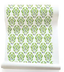
(1)     Hoffman, Josef.  "Blueberry".  Wallpaper.
27' x 180' roll.  2012.  Web.

<http://www.elledecor.com/home-shopping/
articles/natural-beauty>


A pattern is noticed by the eye, recognizing
the repetition of elements forming a regular, anticipated sequence.  (1)  Texture is the
surface quality, determined by the touch.
(2)  These two are intertwined due to the
ability of pattern and textures ability to
mimic each other.  A large difference is in
the organization.  A pattern must repeat or
it can't be a pattern, whereas texture can do
what it wants and live a more organic life.
Even though it is more expensive to go
organic.


A specific type of texture is Tactile Texture.  This is creating the surface with the intentions of it being touched.  (3)  This can be used alone or used to create change going from a smooth surface to a tactile one.


(3)                   Knitta Please.  2012.   Web.  <http://www.facebook.com/knitta>


(4)                 Horn, Nettie.  "Vertical Collage".
Series 1.  No. 3. 2004.  Industrial Floor paint
and household paint mounted on MDF.
79 x 74 x 36 cm.  Web.
<http://www.nettiehorn.com/Exhibitions/Piers%20
Secunda/PiersSecunda_Installation.htm>


We have referred to the term Collage in our text once already, but while talking about pattern and texture it can not be left out.  It is created by putting lots of things together to create a whole.  This things can consist of any texture or pattern placed on a two dimensional space.  (4)  Collage can be used in any art medium, like advertising and individual art pieces bring in the fundamental styling of whole over parts.


Another aspect of pattern and design is Verisimilitude.  This is recreating images in a accurate representation.  (5)  This is not necessarily specific to photo realism, as it applies more to creating something believable in whatever  environment.  This is huge i the fantasy world of video games.


(5)                                                         Mueck, Ron.  "Baby".  Mixed Media.  Feb. 4, 2007.  Web.
                                                                    <http://obscenejester.typepad.com/home/2007/03/index.html>


French for "to fool the eye", comes the term Tromp L'Oeil.  This is when objects are in sharp focus w/ meticulous care to create art that fools the viewer into believing that what they are looking at is real.  This is commonly referred to as "deceptive painting".

(6)                                                                                                                          Banksy.  Graffiti.  Free for all.
                                                                                                                             Web.  <http://www.banksy.co.uk/>


Sunday, May 6, 2012

Art Show Extra Credit!

Tuber, Brandon.  Poster.  2012.  Photo.

Tuber, Brandon.  2012.  Photo.


Twelve year old Austin native, Jade Oakley, has received a scholarship to go abroad to study painting.  On Sunday, April 29th there was an art exhibitions held to kick off his professional career.  We were there to support young Jade.  Along with apples, oranges, cookies and adult lemonade.

Tuber, Brandon.  "Jade on right".
2012.  Photo.


Tuber, Brandon.  2012.  Photo.  Oakley, Jade.  Water Color on Paper.


Chapter 8: Shape

Photo.  Audio CD Cover.  Richard Simmons.  "Super Sweatin': Shimmy into Shape".  6 May 2012.  Web.  <http://www.richardsimmons.com/j15/index.phpop.product_details&product_id=75&flypage=flypage.tpl&pop
=0&option=com_virtuemart&Itemid=81&vmcchk=1&Itemid=81>


Shape is an area created by either enclosing a line or created using color or value to define the edges.  The term Form can also be used to refer to shapes.

Three things a designer can use shape for are to recreate reality on the page, create sculptures, or play with new designs in the fashion world.

1                                  Binkley, Michael.  "Biomorphic Shape #2"
Statuario Marble.  11"H x 14"W x 9"D11"H x 14"W x Web.  <http://www.binkleysculpture.com/sculptureforsale.php


When referring to space, we see the designers needs to work with the Figure, the object in the foreground, and the Ground, which is the space in between figures.  This goes for designers of all kind.  How does an architects design work with the surrounding sky line or neighborhood?  How about each garment in a collection during a fashion show?  An artist can also play with Positive and Negative Space to create different perceptions.


2             UCX.  "New concept for a high-rise
                       apartment building on the waterfront
in Rotterdam".  29 November 2006.  Web.
<http://www.worldchanging.com/archives/005456.html>
3   Jae-Hyo, Lee.  "Pine and Chesnut chair".
              2012.  Web.  <http://label-magazine.com
           /portfolio/pine-and-chestnut-chair-by-
lee-jae-hyo/>


One important shape in design is a Biomorphic Shape.  This type of shape is inspired from mother nature herself. (1)


From Architecture (2) to furniture, (3) Biomorphism is showing up all over in the modern world.


Three shape mainstays are Naturalism, Idealism, Distortion and Nonobjective.  All referring to the view from the designer, but each seen from such different points.  Naturalism (4) is capturing the world around us as it it.  Idealism (5) is the world the way we want it to be, while distortion (6) exaggerates our natural wold  Nonobjective (7) shapes are that unlike anything in our natural world.  This allows the object itself to become reality, allowing art to live in a state of whatever our wildest imaginations can come up with.  Deep.  


5              Marvel.  "Colossus & Kity Pride".
12 June 2012.  Web.  <http://marvel.com
/universe3zx/index.php?title=File:
Colkitty.jpg&filetimestamp=2007061
2175500#file
4    Ryden, Mark. "Self Portrait".  2012.  Twittter.  Web.
<http://twitter.com/#!/markryden>


6               Loopy Dave.  "Van Gogh Caricature".  30 April 2011.  Web.  <http://loyalkng.com/2011
/04/30/van-gogh-caricature-portriat-painting-by-loopydave/


Yanthra, Ramesh.  "2007 001".  Paint on Canvas.  2007.  Web.  <http://www.rameshyanthra.com/?page_id=94>

In chapter seven we discussed the line being the beginning of design, in chapter 8 it takes shape.  This shape defines our  personal spaces and inspires all the creations around us.  As an interior designer knowing all the shapes that can be used is important to a successful career, but knowing the nonobjective is out there, makes me feel better about my own reality.